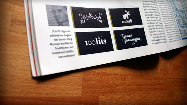
Page with Cyrillic
September issue of German magazine Page appeared with a brief review of the Russian type design.
The Page’s selection is rather unconventional. It includes some young authors and, on the contrary, leaves no room for recognized masters of the Cyrillic type. The article is a very particular mix of historical facts, modern Cyrillic type review and description of some works.
I would like to publish my full answers to the questions of the magazine, which went into the story only as individual quotations.
Page: Is there a special style order approach to design in Russia / the “cyrillic world”?
OM: I don’t think, that there is a special approach to design in Russia. I think, that we even have no our own school in graphic design. We try to find, but unfortunately still don’t have our graphic language. That’s why you can hardly define the work of Russian graphic designer among others. Most graphic designers just copy modern European trends and in most cases their works have no connection with our culture and graphic traditions.
The situation in type design is slightly different. We have other script and it requires special knowledge (about history and traditions of Cyrillic). Moreover we study and live as “biscript” designers. May be it is the most important difference between Latin and Cyrillic designers. As a rule Latin designer initially start with Latin script and after it add other scripts often rather mechanically. On the other hand Cyrillic type designers at the beginning of a project think about both scripts and make forms suitable for Latin and Cyrillic as well.
Page: Which countries of the former USSR have more in common / have good relationships in that case?
OM: Of course Russia has much in common with Ukraine and Belarus. These countries have a long typographic and calligraphic tradition. And generally this tradition is common for our countries. We have common background in a history of Cyrillic writing and almost common history of type.
Page: What are the main differences?
OM: In Ukraine there is more interest to tradition and national culture. It becomes apparent not only in music and fine arts, but also in typography. For example typefaces with a touch of history (or including some historical letterforms) can be interpreted like rather modern and used in design, which is not connected with history. While in Russia the same historical letterforms can be used most likely in fairy tales and something with really archaic taste. Because of this fact typography in Ukraine is more original and distinctive. On the contrary modern Russian typography tries to be more neutral and similar to others.
Page: Is there on-site a longer typographic tradition existing?
OM: Yes, we have a tradition. But it is rather irregular and our tradition is more about revolution, than about evolution. Initially we had our own calligraphic tradition, then we had first typefaces witch were based on this calligraphic scripts. Then was the type reform of Peter the Great, he broke connection between writing and type design. New letterforms were a sort of “latinization”; their nature was rather artificial. After the reform the development of Cyrillic type almost stopped. Publishing business both in imperial Russia and in Soviet Union was mainly under control of the government. So, we have no many typefaces produced during this period and almost all of them are variation of Latin typefaces. And only from 90th (thanks to digital technologies and lack of government’s control) we have chance to develop independently. Of course, somebody continues to copy Latin typefaces or just adds Cyrillic letters to Latin types. But many of Cyrillic type designers begin to produce original typefaces and revive our old calligraphic and type tradition.
Page: What are the main themes for Cyrillic typography?
OM: As stated above after digital age coming many designers continue to add Cyrillic letters to Latin typefaces, other create original typefaces based on old calligraphic scripts. As for me we should find the golden mean… take our historical calligraphy, take our first typefaces, take tradition of Latin typography, mix all these with modern type technologies and get original Cyrillic type.
Page: Which problems do you have to deal with?
OM: Our big problem is the type reform of Peter the Great. As we all know typography has its origins in calligraphy, but for Cyrillic this statement doesn’t work. Peter the Great broke this connection and now most Cyrillic typefaces have much in common with construction, than with writing. Because of reform’s results sometimes it is rather difficult to create some type styles or individual letters in some styles. This was about type designers. Typographers also have some significant problems. Poor typographic tradition and poor cultural background of public give a little chance to work associations. Public in general can only define three sorts of type associations: soviet type, classical type from 19th centaury and very-very old church type. Graphic designer can use different typefaces and can choose between Venetian serif and Dutch serif, but it’s all the same to public, they would think that it is something from 19th century. So, it’s rather difficult to create complicated and interesting things among people who have no idea about graphic and visual culture.
Page: How does Russia look at the world?
OM: Unfortunately, modern Russian graphic designer looks too fixedly at the world, he tries to follow all possible world’s tendencies. He knows more about Émigré and Pentagram, than about Cyrillic typography of 17th century or design conceptions of Russian avant-garde. It is very disappointed for me, because I want Russian designer to look into himself and into our own tradition. We should look at the world not to copy trends, but to learn to value originality of our own culture.
Page: How should the world see Russia and its Designers beyond the popular clichés?
OM: The world should see, that Russia is a different culture, with its national peculiarities and special way.
It may seem strange to you, that at one moment I speak about Russian culture as about rich one and at another as about poor. But it’s our reality. We have a lot of beautiful things in Cyrillic type design and in graphic design history. But they stay history facts and we don’t use them in our design practice. For many world’s designers (not only graphic) Russian avant-garde is the key to profession and for Russian designers avant-garde is just a good period in our history. So, I think, that it’s time for us to produce vivid tradition from our history